

BRIGHTDIME BRANDING

HUMANIZING FINANCIAL WELLNESS
Financial wellness is often shrouded in complexity and stress. The goal for BrightDime was to strip away that intimidation and replace it with a visual voice defined by clarity, confidence, and calm. By balancing professional expertise with human warmth, the brand was repositioned to support progress toward financial wellness without the pressure.
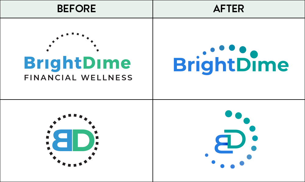
We shifted the brand from an overcomplicated, transactional feel to a modern, human-centric identity. The goal was immediate clarity, replacing intimidation with a sense of safety and relief.
FROM ‘OUTDATED’ TO ‘MODERN’
VISUAL IDENTITY:
THE ARCHITECTURE OF TRUST
The refreshed logo reflects progress without pressure. A refined wordmark anchors the brand in trust, while a new “Progress Arc,” a dotted trail of momentum, suggests forward movement and growth. The transition from blue to teal in the gradient represents clarity evolving into confidence.
COLOR & TYPOGRAPHY:
BALANCING CONFIDENCE WITH CLARITY
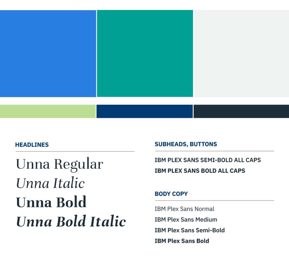
Palette: The core blues and teals are designed to anchor the brand in credibility while reflecting forward progress. Charcoal is used for body copy as a friendlier, more approachable alternative to pure black.
Typography: The system uses a refined serif, Unna, to bring an editorial sense of confidence to headlines. This is paired with IBM Plex Sans for body copy to ensure maximum readability and a modern, structured feel.
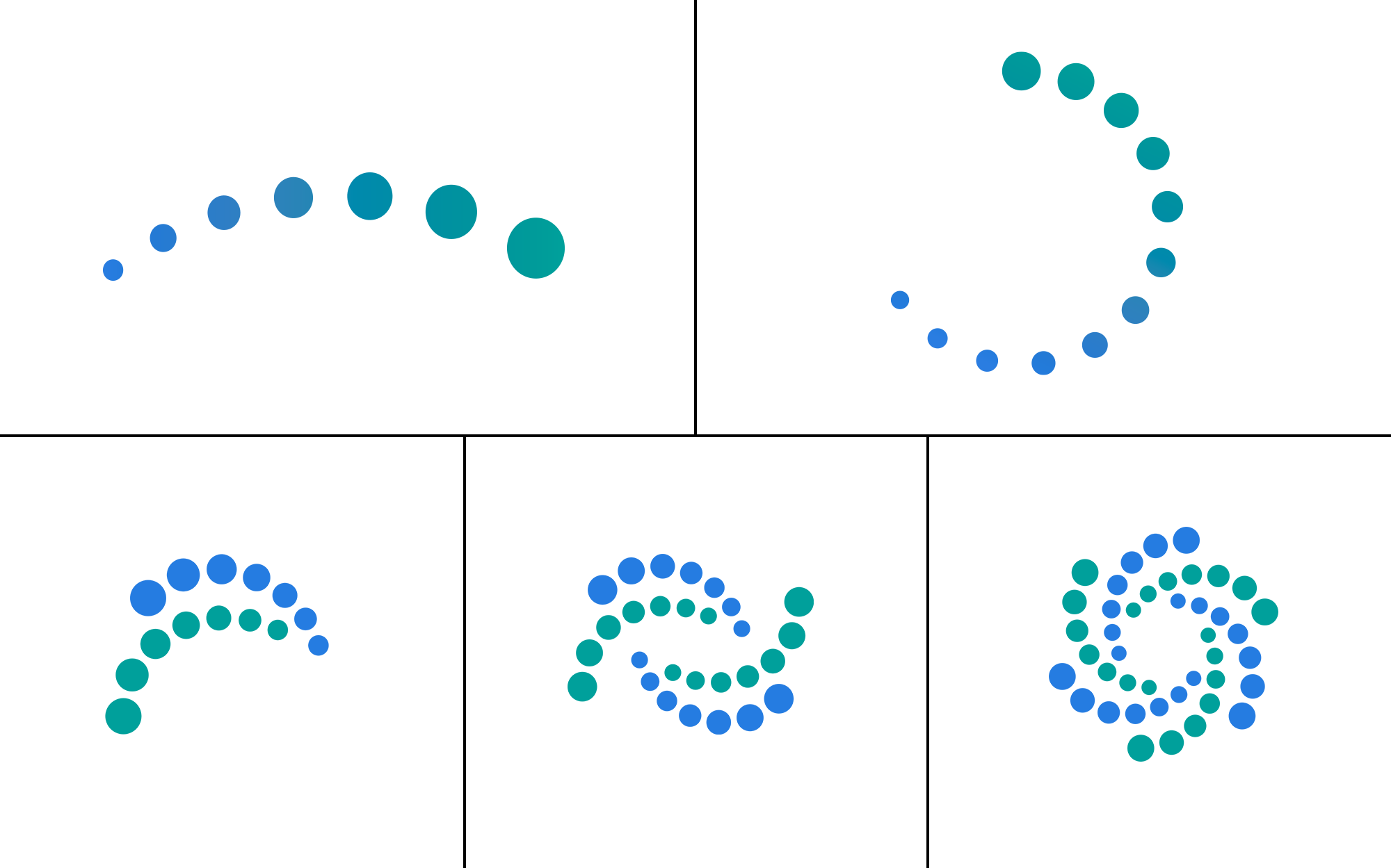
PROGRESS AS A GRAPHIC ELEMENT
To reinforce the idea of attainable growth, the “Progress Arc” was integrated as a functional graphic element. For membership tiers, the arc adds density to signal expanded support and deeper engagement as users move from Essentials to Complete levels. This allows the brand to communicate hierarchy without creating a sense of pressure.

PHOTOGRAPHY DIRECTION:
THE HUMAN ELEMENT
To move away from "corporate coldness," the new creative direction prioritizes authenticity. Photography now focuses on natural light, warm tones, and friendly, reassured people in community settings. This shift ensures the brand feels optimistic and inspiring, rather than relying on faceless imagery or finance cliches.
BRANDING APPLIED
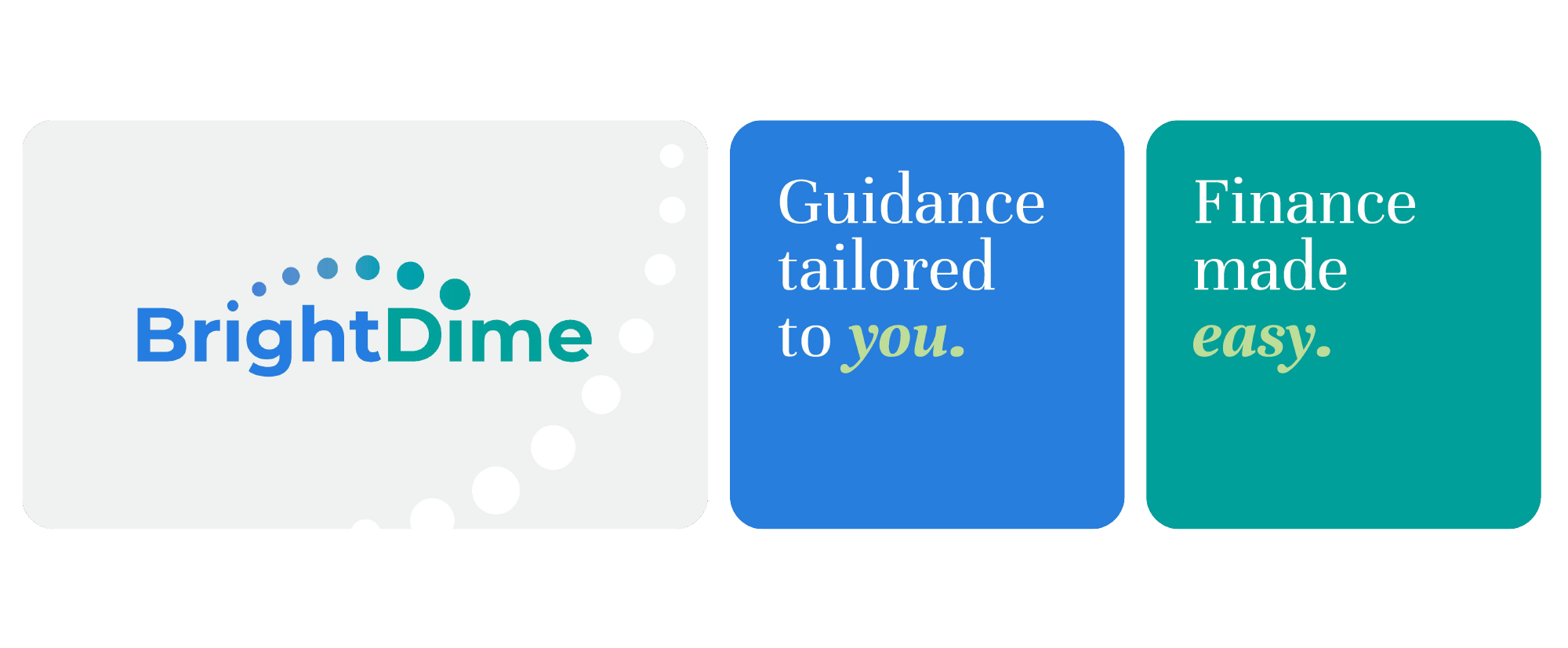
The transformation extended into a complete overhaul of marketing materials, shifting from instructional guides to persuasive, narrative-driven sales tools. By utilizing hierarchy, visual pacing, and warmer imagery, the new digital presence makes the brand's value immediately obvious and evokes a positive emotional response.